 This is a chart of the index value of FTAS tracker. It is the rolling-average of the index-value over 1 to 2 months, and then the daily values are plotted relative to the local average (black traces) The green line was then added for mean purposes (this is not the absolute value but the index), creating an index value plot. yay!!
Monday, December 8, 2008
Index Value Plot
This is a chart of the index value of FTAS tracker. It is the rolling-average of the index-value over 1 to 2 months, and then the daily values are plotted relative to the local average (black traces) The green line was then added for mean purposes (this is not the absolute value but the index), creating an index value plot. yay!!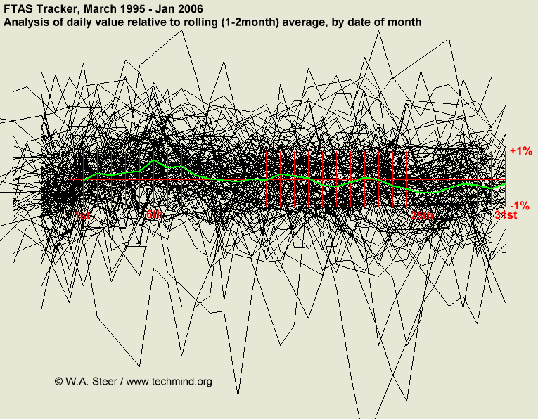
Subscribe to:
Post Comments (Atom)
No comments:
Post a Comment