skip to main | skip to sidebar

Monday, December 8, 2008

Cartogram

This cartogram is distorting the United States to truthfully show how much weight in terms of voting each area really had. For example, the blue area that is blown up in south florida is showing that there is a huge population in that Palm Beach County/Miami 
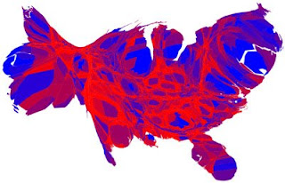
Dade area who voted Democratic, as well as in the Northeast and the western united States.
http://infosthetics.com/archives/cartogram.jpg
Posted by rls05g at 4:38 PM

No comments:

Post a Comment

Newer Post Older Post Home
Subscribe to: Post Comments (Atom)

Maps Maps Maps

Blog Archive

  • ▼  2008 (51)
    • ▼  December (50)
      • Star plot
      • Correlation Matrix
      • Similarity Matrix
      • Stem and Leaf Plot
      • Box plot
      • Histogram
      • Parallel Coordinate Graph
      • Triangular plots
      • Windrose
      • Climograph
      • Population Profile
      • Scatterplot
      • Index Value Plot
      • Lorenz curve
      • Bilateral Graph
      • Nominal Area Choropleth Map
      • Unstandardized Choropleth Map
      • Standardized Choropleth Map
      • Univariate choroplath map
      • Bivariate choropleth map
      • Range graded proportional circle map
      • Continuously variable proportional circle map
      • DOQQ
      • DEM
      • DRG Map
      • Isopleth
      • Isopachs
      • Isohyets
      • Isotach
      • Isobars
      • LIDAR
      • Doppler Radar
      • Black and White Aerial Photo
      • Infrared Aerial Photo
      • Cartographic Animation
      • Statistical Map
      • Cartogram
      • Flow Map
      • Isoline Map
      • Proportional Circle Map
      • Choropleth Map
      • Dot Distribution Map
      • Propaganda Map
      • Hypsometric Map
      • PLSS Map
      • Cadastral Map
      • Thematic Map
      • Topographic Map
      • Planimetric Map
      • Mental Map
    • ►  October (1)

About Me

rls05g
View my complete profile