 A starplot that tells illustration of selected peak ratios in oils for collected fingerprints. This particular star plot shows that 1,2,3, and7 are similar, and 4,5, and 6 are different.
Monday, December 8, 2008
Star plot
A starplot that tells illustration of selected peak ratios in oils for collected fingerprints. This particular star plot shows that 1,2,3, and7 are similar, and 4,5, and 6 are different.
Correlation Matrix

This is a correlation Matrix showing computer values for a company. The infomation would only be useful to this company, but it helps determine the point of this kind of matrix, which is correlating data.
Similarity Matrix
 This is a similarity matrix for the Bible in Italian. This could be compared to other matrices, which will show the similarity between the languages. These graphs are used to compare and contrast with one another.
Stem and Leaf Plot

The stem and leaf plot generally finds the shape of distribution and it includes actual numerical values in a graph. It is better with less amounts of data. This stem and leaf plot shows that the 40's has the most numbers, in this particular amount of information.
Box plot

This box plot is typical, showing the values of car mileage, based on where they were produced (the country). It shows that Japan makes cars with the average highest mileage, but that is not to say they dont make cars with low mileage (as is determined by the dotted line underneath the box, giving levy to the information.)
Histogram

This simple histogram is showing the scores on a test, which is the independent variable, by the number of students, which is the dependent. This histogram is the more commonly seen, using " rectangles to show the frequency of data items in successive numerical intervals of equal size."
Parallel Coordinate Graph

This parallel coordinate graph shows multivariate lines and coordinates for different data sets. We are viewing all the cells measured in an organism in nine different genes.
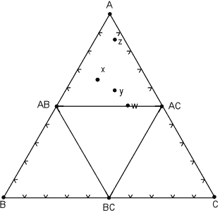
Triangular plots

This Triangular Plot is showing a set of minerals that are in equilibrium over a narrow range of temperature and pressure. The tie lines represent mineral phases that coexist with each other.
Windrose
 This is a windrose diagram. It is showing the relative frequency from which direction the winds are coming from, per 10 degrees. Basically the point is to give the windspeed, as we can see.. this is 2 mile hour winds.
Climograph

This is a graph of the climate of a midwestern state. It is measuring the drought possibilities; he bars represent the celsius temperature while the line represents the rainfall in centimeters. Together they form a climograph. yay!
Population Profile
This graph is giving a population growth count for two populations, male and female, in Mobile County ten years ago. This graph shows males as dark blue, and it appears that there are more older females than males.

Scatterplot
This is a simple scatterplot of data showing how many miles per gallon the measured cars get depending on their weight. While it doesnt give exact numbers, the points are not yet averaged on there, as the intervals are small enough to determine an accurate approximation.

Index Value Plot
 This is a chart of the index value of FTAS tracker. It is the rolling-average of the index-value over 1 to 2 months, and then the daily values are plotted relative to the local average (black traces) The green line was then added for mean purposes (this is not the absolute value but the index), creating an index value plot. yay!!
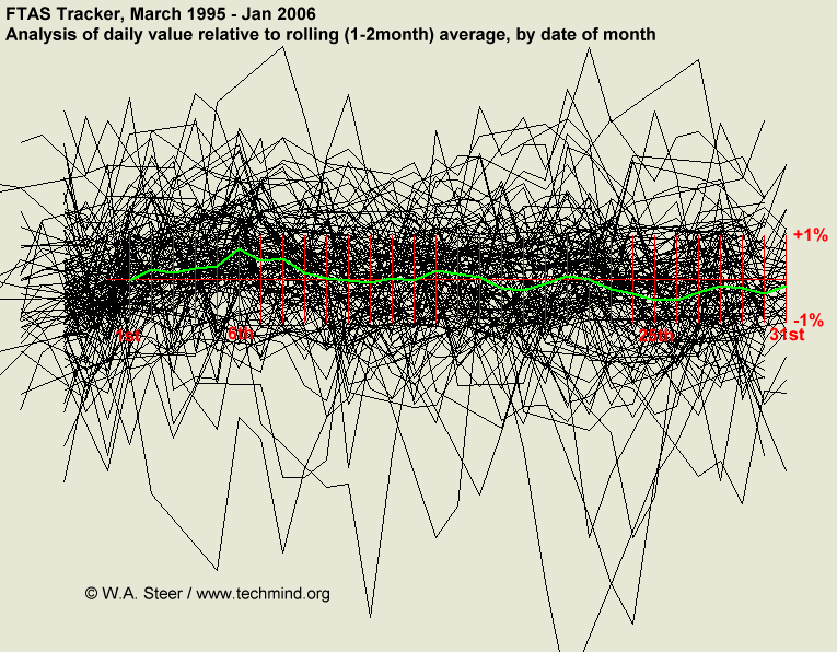
Lorenz curve
 This is a lorenz curve. It is comparing the actual data to the equal distribution line. The green line is the perfect equal distribution and the red is the actual data.
http://content.answers.com/main/content/wp/en/b/bd/Lorenz-curve1.png
Bilateral Graph
 This is a graph of corporate net lending. It is bilateral because is shows both positive and negative values (in percents) of the gross domestic product. Needless to say, this graph is labled unusual flows and is in the negative more often (meaning serious debt).
http://www.pastpeak.com/clips/Debt1.gif
Nominal Area Choropleth Map
 This map is showing the minority group that has the highest percent of population within the state. Hispanics are the highest populated minorty of the west and florida, while two or more races cover main. The North has Asian. The rest of the united states, Black is the dominant minority.
Unstandardized Choropleth Map
 This is an Unstandardized choropleth map. It's a bunch of original data before it has been averaged or played with. The numbers are raw, and the variables are schizophrenia patients and those compared.
Standardized Choropleth Map
 This is a standardized choropleth map. The units and the variables remain standard throughout the entire map. This map is measuring the population of 14 years of age and under in Canada. The dark green areas represent 36% of the population is under 14. The light green, which seems to be mostly the large cities, are areas with less than 11%.
Univariate choroplath map

This map is a normal choroplath map with one variable. It is showing, again, the outcome of the presidential election in terms of the populations of republican and democratic voters of America per county. There is no relationship in this map, for example, it would be bivariate if it were comparing this information with gender or age.
Bivariate choropleth map
 This map is a Bivariate choroplath map and pie chart of the land use, life expectancy, and GNP per capita in Afica 1989. It is simply bivariate because there are two variables, land use and life expetancy.
http://www.geocities.com/stevejford/Africa_Choropleth.jpg
Range graded proportional circle map
 This range graded map is different from other proportional circle maps because it is range graded, which means the circles have a limit and specifications for their size. This is showing what states have the most mexican population. There are five different sizes the circles can be. The largest is 5 million. The smallest is 3,000. This is not to say the populations are exactly so. It is only a guide to be able to compare states.
Continuously variable proportional circle map
 This map shows the circles in proportions to how important they are. Obviously, the larger the circle, the more important the industries as a whole are, in that area. The different colors are different industries, for example, iron, steel, mechanical, chemical, etc.
DOQQ

This is a Digital Orthoimagery Quarter Quadrangles Map with a 1 meter ground resolution. It is an aerial map used for accuracy for mapping purposes and scaling purposes.
DEM
 This Digital Elevation Map is showing a crater lake in Oregon. It is photoshopped to make sure you know there is water, but it is just a 3D image of the ground as it would be seen from a satelite or plane.
DRG Map

This DRG map is a USGS topographical map, reproduced and put onto a computer. It has many uses, for example, this could be a map for someone unfamiliar with the colorado area and wanting to explore. The map is of Colorado and includes many tourist attractions (the rivers, roads, and business locations).
Isopleth
 These three maps are simplifying the surface elevations or amount of pressure/precipitation of a certain area. They are intervaled and the points compare to each other to determine the values.
Isopachs
 This is an asopach map of the ashfall from Cerro Negro. They are measured in centimeters and the 10 cm marker in the middle is closest to the crater.
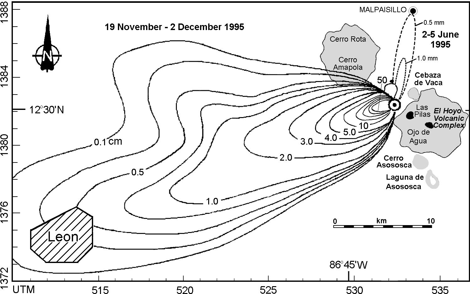
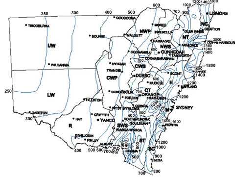
Isohyets

This map is showing the limatic zones and isohyets of the average annual rainfall in new South Wales for stations with more than 20 years of records. It is measured in millimeters.
Isotach

This map is showing the observations by meterologists of the environment in a time where tornado outbreaks were prominent. The purple represents the highest speed.
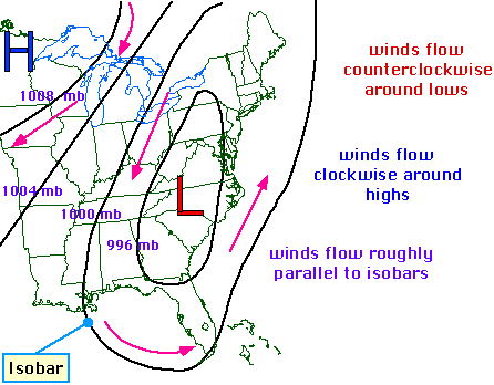
Isobars

This map shows isobars over the Northeastern part of the united states. It is showing the pressure differences throughout the region and the high and low (H and L) pressures.
http://ww2010.atmos.uiuc.edu/guides/maps/sfcobs/cntr/gifs/wind1.gif
http://ww2010.atmos.uiuc.edu/guides/maps/sfcobs/cntr/gifs/wind1.gif
LIDAR

This is the LIDAR image of manhattan, more specifically ground zero. This digital picture shows the tallest buildings in brown while the sea level is in the green.
Doppler Radar

This is a doppler radar image of the weather. This is Hurricane Francis over Florida, centered around Orlando in March of 2004. The red and orange are the strongest points of the hurricane, where the blue are outside winds.
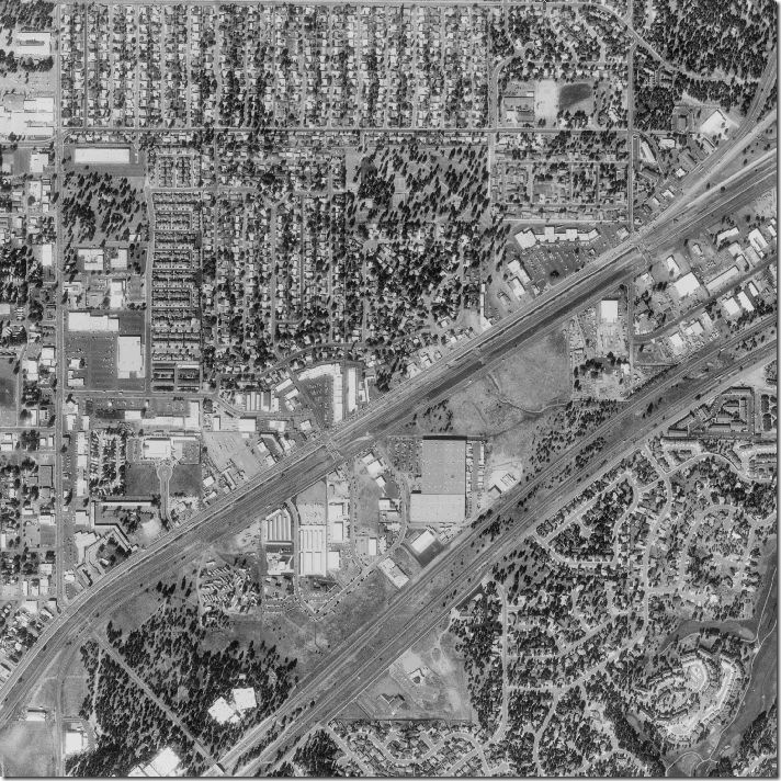
Black and White Aerial Photo
 This black and white photo is showing the aerial view of someones neighborhood. This was taken from google earth, where you can get aerial photos (but not very very recent on google earth) from anywhere on earth. This is a top view of a town.
http://freegeographytools.com/wp-content/uploads/2007/09/doq-thumb.jpg
Infrared Aerial Photo

This map is showing an area of a country where there have been changes in the environment. In this case, it could have been the health of forests or wetlands. The light in the camera is sensitive to a certain portion of light, creating the red look on the map to provide the information sought.
Cartographic Animation
 This map is giving a clear picture of the evolution that became from a Gibbon to a Man. The map shows the skeletons of these creations in an animation from what it once was to what it now is.
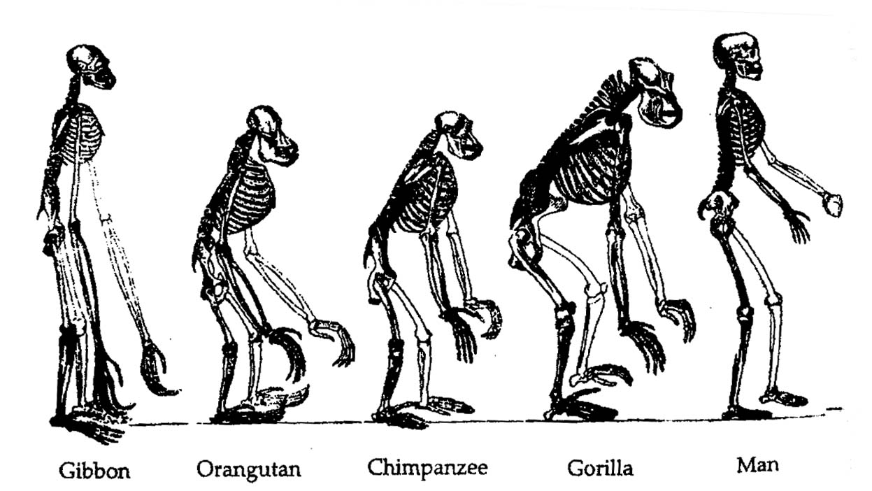
Statistical Map

This map is showing the change in larceny crimes in this area of Denver Colorado from 2001 to 2002. These statistics show that the yellow areas have decreased in the crime while the orange have increased. If you notice, the larger counties have increased more.
Cartogram
This cartogram is distorting the United States to truthfully show how much weight in terms of voting each area really had. For example, the blue area that is blown up in south florida is showing that there is a huge population in that Palm Beach County/Miami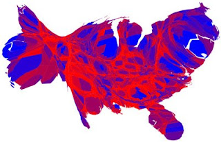 Dade area who voted Democratic, as well as in the Northeast and the western united States.
 Dade area who voted Democratic, as well as in the Northeast and the western united States.
Flow Map

This is a flow map that is showing the combines network truck flow in tons. in the United States, obviously with Texas having the most truck flow. The thickest red lines are more than 50 million tons.
Isoline Map

Here is an isoline map that is showing the distribution of temperatures across North Carolina. The purple spots show the warmest areas in January of 1981. The light blue show the coldest.
Proportional Circle Map

This map uses circles to determine which state in this region has the oldest homes, or, the most homes built before 1940. The larger the circle is, the more homes there are that were built before 1940. Obviously, California has the most while Nevada has the least.
Choropleth Map

This map, as it shows, is portraying the average weight of a vote in, for example wisconsin, in relation to a vote in Florida. It is showing that the electoral college makes voting unequal. This choropleth map could also be a propaganda map.
Dot Distribution Map
 This map is showing the outbreaks of duckweed with dots and their occurance across the world. The numbers indicate the occurances were due to the climate conditions being too wet, dry, cold, etc.
http://www.mobot.org/jwcross/duckweed/Lemna_graphics/Map2.gif
Propaganda Map

This propaganda map is showing the obvesity in the united states in relation to where people live. This maps legend is showing differnet faces of different levels of obesity and when they will start experiencing health problems in their lives. It is trying to scare people into becoming healthy and making people aware the obesity is a problem.
Hypsometric Map

This hypsometric map is similar to many different types of maps, incuding topographic, political, or other land features maps, as some physical features are shown. There is more detail as far as color intervals (there are much more). This map is of the Asian country Tajikistan.
PLSS Map

This map, a public land survey system, is showing the grids that divide each section of this city by townships and counties. Each grid represents a different ownership.
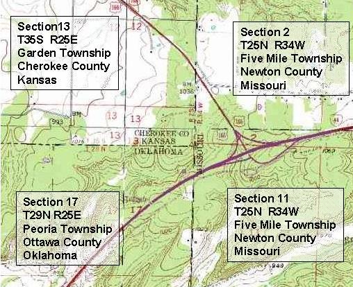
Cadastral Map

This map is not very detailed or descriptive, but it is nevertheless showing ownership of different parts of a city or area. Probably, the blue areas are commercially owned, where the red areas seem to be streets or other state owned highways. Green could represent peoples private property or individual businesses.
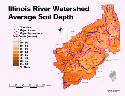
Thematic Map

This map is pretty self explanatory, as most thematic maps are. It is showing the soil depth across North Central Illinois, in relation to where rivers and major watershed are located. This map has ten intervals of measurment in it.
Topographic Map
 This map is showing the topography along the coast of these islands. The darker green is probably forest and tree areas, where the lighter green is grassy areas. The white may be showing beaches.
http://www.bigbaytech.com/images/charts85.jpg
Planimetric Map
 This map shows a specific area that is under study by a program. The area in the red square that is specifically pointed out on Englebright Lake shows where they are measuring sediment buildup.
Mental Map
 This is a mental map of what appears to be a school campus, and the red arrows are exits of some sort. This person probably chose either the exits they use, fire exits they know of, or ways to get off campus (the red arrows).
Subscribe to:
Posts (Atom)