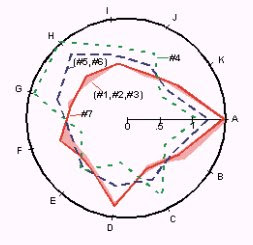
 A starplot that tells illustration of selected peak ratios in oils for collected fingerprints. This particular star plot shows that 1,2,3, and7 are similar, and 4,5, and 6 are different.
Monday, December 8, 2008
Star plot
 A starplot that tells illustration of selected peak ratios in oils for collected fingerprints. This particular star plot shows that 1,2,3, and7 are similar, and 4,5, and 6 are different.
Correlation Matrix
Similarity Matrix
Stem and Leaf Plot
Box plot

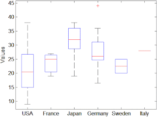
This box plot is typical, showing the values of car mileage, based on where they were produced (the country). It shows that Japan makes cars with the average highest mileage, but that is not to say they dont make cars with low mileage (as is determined by the dotted line underneath the box, giving levy to the information.)
Histogram
Parallel Coordinate Graph
Subscribe to:
Comments (Atom)


